Complementary Colors in Watercolor: From Contrast to Neutral Grays
What Are Complementary Colors?
*For a better understanding of color basics, please visit my post on The Color Wheel Isn’t What You Think (Hue, Color, Black & White) or watch YouTube Video.
Complementary colors are pairs of hues that sit directly opposite each other on the color wheel—for example:
- Red and Green
- Blue and Orange
- Yellow and Violet (Purple)

When placed side by side, complementary colors create the strongest visual contrast. Each color appears more vibrant, producing dynamic tension and visual excitement.

Complementary Colors and Contrast
Artists often use complementary pairs to create emphasis or direct attention to a focal point. A classic example is Vincent van Gogh’s Café Terrace at Night (1888).

In this painting, the glowing yellow-orange café is set against a deep blue night sky—its direct complement. This pairing makes the café instantly pop as the focal point, pulling the viewer’s eyes toward it.
This powerful effect of contrast deserves a deeper discussion, and I’ll return to it in a future lesson. For now, let’s shift to another side of complementary relationships: how they help us create subtle, beautiful neutrals.
Our Focus: Mixing Beautiful Neutral Grays with Complementary Colors
The dual nature: the same color pairs that produce the highest contrast can also yield the most nuanced neutral grays when mixed together.
- Placed side by side → maximum contrast.
- Mixed together → they neutralize each other, canceling intensity to create a muted tone.
Why Not Just Use Black and White?
In a previous post, I explained why watercolorists typically avoid black and white paints. Mixing them often results in flat, lifeless grays.
Yet beginners frequently ask: “Then how do I make gray?”
And I understand why. When beginners see something gray—like a metal object—they instinctively think of mixing black and white. But that approach often results in a dull, lifeless gray.
The answer lies in complementary mixing. Compare that to the beautiful, neutral grays created from complementary colors. These grays carry temperature, subtle color shifts, and life. They’re not just gray—they’re warm or cool, leaning toward violet, green, or orange, depending on the mix. They’re expressive.
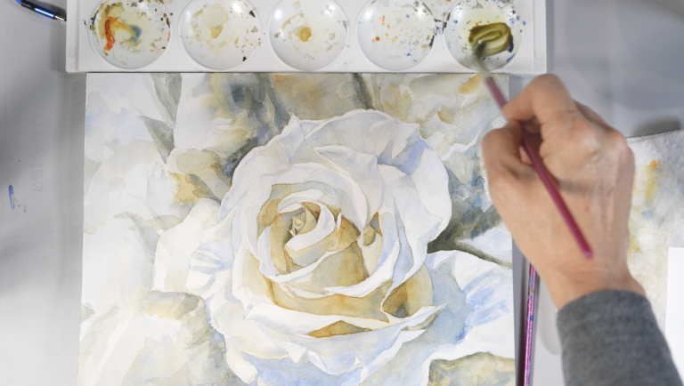
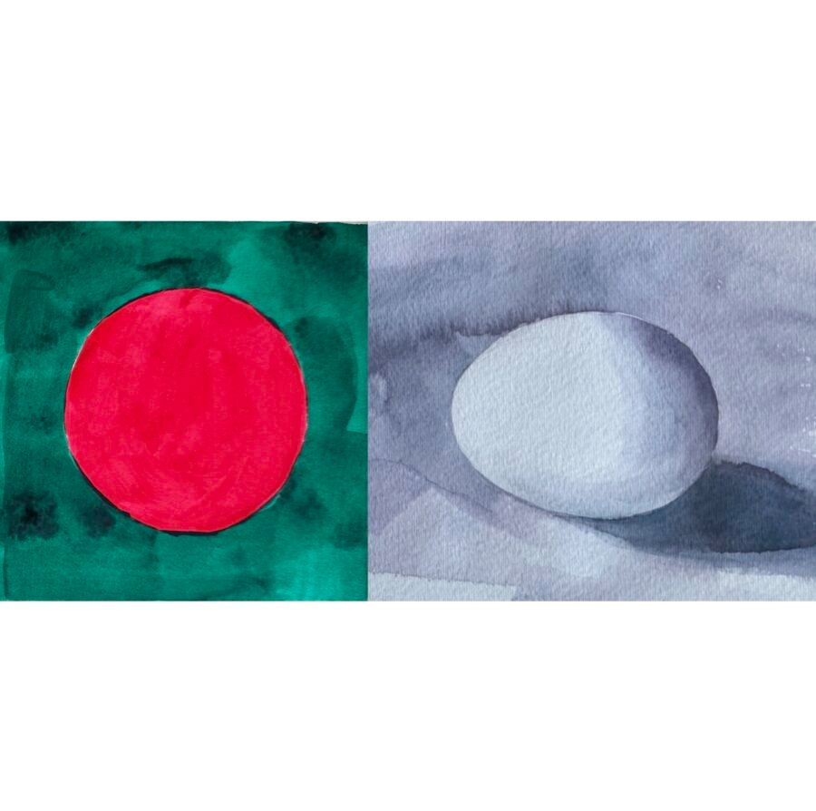
The sample work below was created using a neutral palette made by mixing red and green—complementary colors.

The Expressiveness of Neutral Colors
Some of the most masterful painters are those who handle neutrals with finesse. If you look closely at great artworks, you’ll notice that very few areas use pure primary colors. Instead, the strength of a painting often rests on nuanced mixtures—especially neutral tones.
In this sense, an artist’s ability to manage neutrals reflects their color vocabulary—how fluently they can express through color relationships. Just as in language, some artists have a limited vocabulary, while others have a rich, nuanced one that speaks volumes.
A Neutral Color Scale from Complements
To demonstrate, I created a neutral color scale using three complementary pairs.

Focus on the middle of each scale—this is where you’ll find the most balanced neutrals: a beautiful range of nuanced tones, from warm, stone-like hues to cool, stormy grays.
Create a painting using one of the three complementary pairs. This exercise not only trains your eye to see subtle shifts in tone and temperature, but also expands your creative palette far beyond premixed blacks and grays.
Please watch my YouTube video.