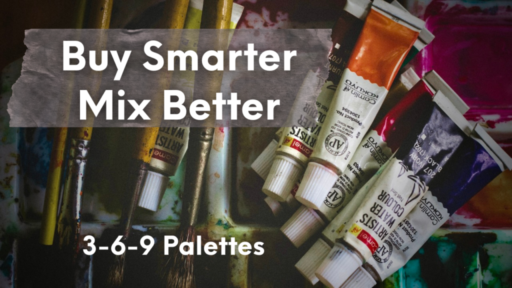
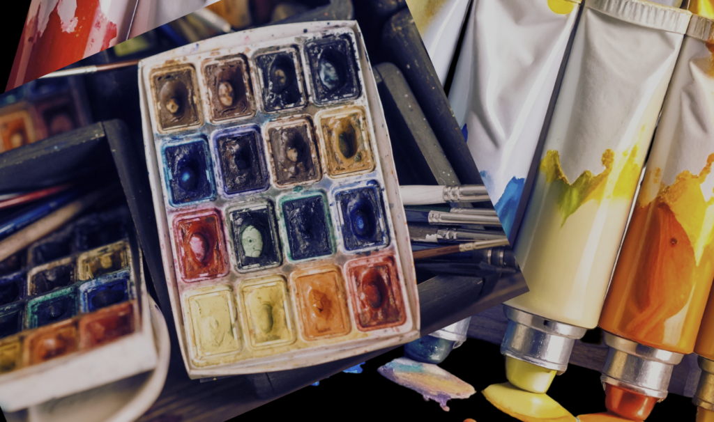
Essential Budget-Conscious Watercolor Supplies (That Even Pros Use)-Part 1: Paints
Watercolor is often introduced as an “affordable” medium, but in practice, many people quickly discover the opposite. Artist-grade paints, 100% cotton paper, and specialty brushes add up fast—and it’s enough to scare many beginners away before they really start.
I’ve watched people step back from learning simply because the supply lists felt overwhelming and expensive, not because they lacked interest or ability. I don’t believe cost should ever be the barrier that keeps someone from creating.
That belief is the reason for this series: Essential Budget-Conscious Watercolor Supplies (That Even Pros Use).
Rather than presenting one long, exhaustive list, I’m dividing this topic into focused parts:
- Paints
- Paper
- Brushes & palettes
Each post will focus on a single category and outline essential choices at different levels, so you can decide what fits your budget, goals, and working style. Under the same budget, one artist may choose a wide student-grade palette, while another invests in just three carefully chosen artist-grade colors. Both approaches are valid.
How to Think About Paint Choices
With so many brands and pre-made sets available, choosing watercolor paints can quickly feel overwhelming. The guidelines I share here are intended for those who want to build a strong academic foundation in painting—while remaining mindful of cost.
Before looking at specific palette structures, a few important notes:
- I haven’t tested every watercolor brand on the market. My recommendations are limited to paints I’ve used directly or researched carefully.
- This does not mean other brands are inferior. You are free to explore any brand within your budget, as long as the colors meet the essential criteria outlined below.
- In my earlier videos and demonstrations, I’ve discussed watercolor basic techniques and characteristics such as transparency, staining, and handling. These principles apply regardless of brand.
- Not everyone needs premium artist-grade paint to begin learning seriously—or to make meaningful progress.
What Matters More Than Brand

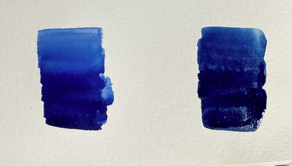
When choosing watercolor paints, brand name matters far less than how the paint behaves. Regardless of label, look for colors that offer reasonable brightness and transparency, mix cleanly, and handle predictably on paper.
Throughout this series, I use a two-tier approach—practice paints used freely for learning, and a smaller selection reserved for long-term work. The difference lies in how the materials are used, not in artistic legitimacy.
Once these fundamentals are in place, brand choice becomes flexible.
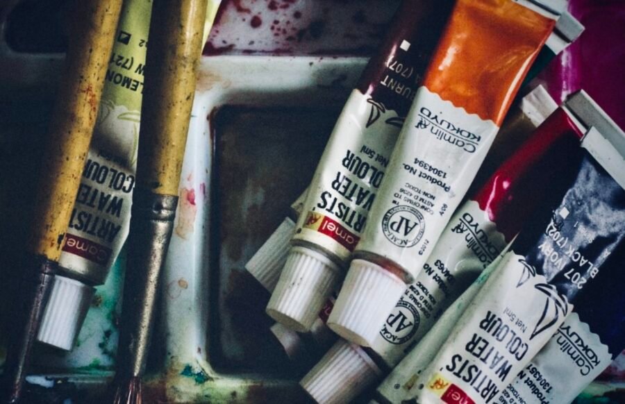
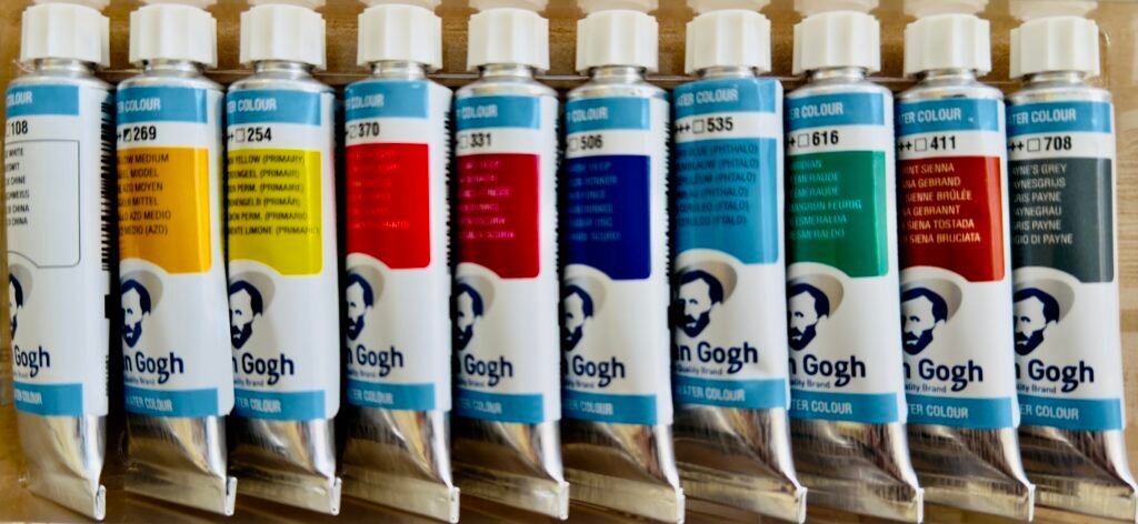
Tube Paints vs Pan Paints
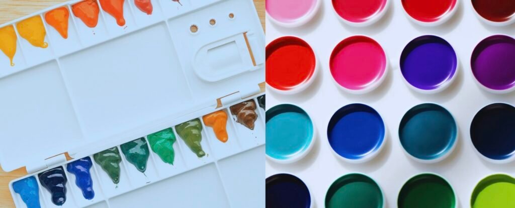
Watercolor also comes in several forms (tubes, pans, sticks, liquids). Here I’ll focus on the two most common: tubes and pans.
Tube Paints
I generally recommend tube paints, especially for learners who want to practice color mixing and paint regularly. Tubes are less convenient for travel, but you can always squeeze paint into a palette and let it dry overnight. Dried tube paint can be reactivated much like a pan.
- Tubes are fresher and easier to mix.
- They allow generous use without hesitation.
- They work better for extended mixing exercises.
- Long‑term cost depends on your habits: larger tubes are more economical, but if you rarely use them, they may dry out. (You can still cut open a dried tube and use it like a pan.)
Pan Paints
- Convenient and compact; great for sketching on the go.
- Ready‑made sets include a built-in palette, though mixing space is often limited.
- Paint can take longer to activate.
- Some pan paints feel binder-heavy on the brush, with more additives that change the flow.
This varies by brand, but even reputable pan sets can feel noticeably different from tube paint in flow and response.
Long-term cost depends on your working habits. Pans last a long time; tubes are more economical for heavy use. Knowing how you work matters more than choosing the “right” format.
Essential Palettes: Three Levels to Choose from
Rather than starting with brands or boxed sets, I prefer to start with palette logic. This can be adapted to many brands and price points.
*I’ll be using these essential palettes in future demonstrations, so if you’re interested in seeing how they work in real painting situations, stay tuned.
1. Essential Three: Three Primaries
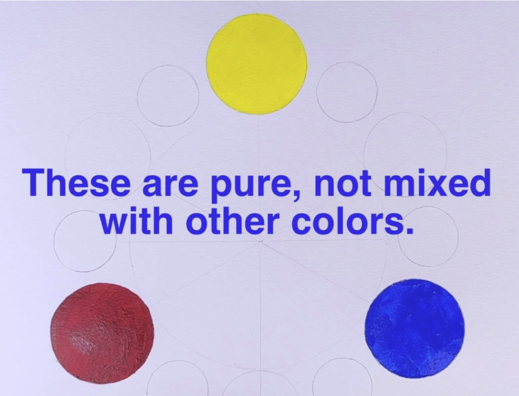
With only three paints—one yellow, one red, and one blue—you can build a fully functional palette.
Look for relatively neutral temperatures, not extremes. Choose one in each hue family.
- Yellow: Hansa Yellow Medium ((PY97 / PY74) or Permanent Yellow/Benzimidazolone Yellow (PY154/ PY110 )
- Red: Naphthol Red (PR170) or Pyrrole Red (PR254, PR255)
- Blue: Ultramarine Blue (GS) (or Phthalo Blue)
This minimal palette teaches strong mixing skills and helps you understand color relationships quickly. Almost everything else can be mixed from these three.
2. Essential Six: Primaries + Secondaries
Yes, you can mix secondary colors from primaries, but consider:
- Clean, vivid greens and purples can be difficult to achieve only through mixing.
- Having secondary colors makes it easier to create cleaner, more balanced neutrals.
- Adding these three secondary colors often makes the painting process noticeably more efficient.
Suggested additions:
- Orange: Benzimidazolone Orange (PO36) or Azo Orange(PO62)
- Green: Viridian (PG18) or Phthalo Green (PG7 / PG36)
- Purple: Dioxazine Purple (PV23)
This tier balances learning with practicality.
3. Essential Nine: Cool & Warm Primaries + Secondaries
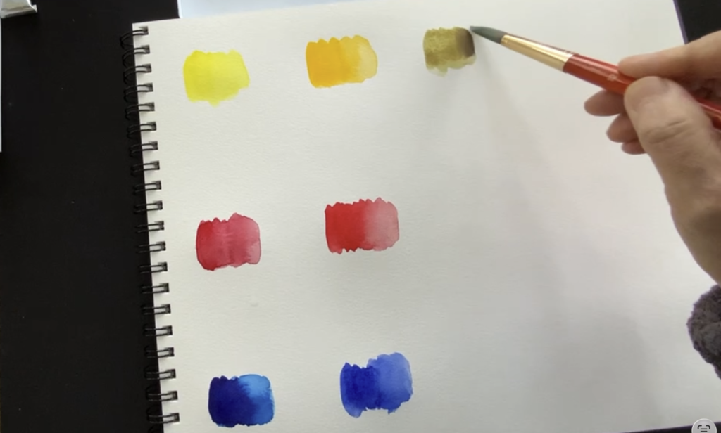
Adding both cool and warm versions of each primary gives you much more flexibility. You’ll get cleaner mixes and better control over color temperature.
Brand names vary, so choose the closest equivalents.
Yellows
- Cool: Hansa Yellow Light or Lemon Yellow (often “Lemon Yellow Hue” in student lines) or Cadmium Yellow Light
- Warm: Cadmium Yellow Deep or Hansa Yellow Deep or New Gamboge
Reds
- Cool: Permanent Alizarin Crimson (PR177, PR264, or PR149 ) or a Crimson/ Alizarin-type red (often “Alizarin Crimson Hue” in student lines) or not quite red family but Quinacridone Rose or Permanent Rose
- Warm: Cadmium Red (often “Cadmium Red Hue” in student lines) or Scarlet or Vermilion
Blues
- Cool: Phthalo Blue (Green Shade)
- Warm: Ultramarine Blue
You can continue using the same secondaries from the Essential Six. At this stage, multiple versions of each secondary are not necessary.
A Note About Greens (My Opinion)

Many artists recommend Sap Green, and many small sets include it as the only green. It’s popular and absolutely useful.
However, if choosing only one green, I often prefer Viridian or Phthalo Green (staining though) because they offer more flexibility for neutral mixing:
- Sap Green tends to lean warmer, which can make it harder to mix clean neutral grays.
- Warmer greens are easy to create through mixing.
- Cooler, deeper greens are harder to replicate convincingly if you don’t already have one available.
Preferences and Optional Additions
Beyond this point, palette choices become more personal. What you add depends on:
- What you paint (landscapes, florals, portraits, urban sketching).
- How you like to work (loose vs detailed).
- Which colors you naturally reach for again and again.
Even among “essential” palettes, artists happily disagree—and I’m no exception. Over time, you’ll develop your own preferences through practice, research, and repeated experience. My hope is that you eventually build a palette that feels both personal and dependable.
I also encourage you not to lock yourself in too early. Test colors over a longer period before deciding that your palette is “finished.” That way, you won’t miss out on combinations that suit you better.

You may notice that I did not include several popular colors that appear in many small sets, such as Yellow Ochre, Burnt Sienna, and Payne’s Gray. These are wonderful and extremely useful, especially for landscapes and portraits. However, I see the colors mentioned above as more essential at the beginning, because they strengthen your mixing ability and give you broader control over temperature and neutrals.
Once the essentials are in place, adding these “comfort colors” becomes a thoughtful choice.
If I were to add just one more color beyond the essentials, it would be a deep, rich blue (such as Prussian Blue or a similar dark blue) to reach lower values efficiently.
Identifying Colors Across Brands
Color names vary widely between brands. The same color may have different names across brands, and the same name may look slightly different from one brand to another.
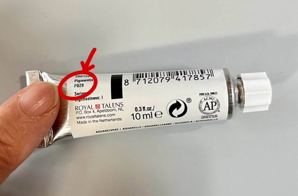
When consistency matters, look at pigment numbers, not names.
- The code starts with “P” for Pigment, followed by a letter indicating the color family (Y for Yellow, R for Red, B for Blue, Br for Brown, etc.), and then a number for that specific pigment.
- For example, PB29 = Pigment Blue 29, which is Ultramarine Blue in most brands.
Understanding this system will help you compare brands more accurately. I’ll cover this topic in more depth in a future post.
Working with Two Tiers of Paints
My guiding belief remains simple: cost should never be the barrier to creating.
To support that, I think in two tiers:
- Practice Tier: affordable student-grade paints used freely for exercises and exploration.
- Study & Archival Tier: a small selection of affordable artist-grade paints for long-term work
What is the difference?
The main difference between the two is pigment concentration and overall formulation:
- Artist‑grade paints contain more pigment and fewer fillers. Colors are brighter, deeper, and more predictable as they dry.
- Student‑grade paints often contain less pigment and more extenders, which can make colors appear duller or less saturated.
You don’t need to buy everything at once. Start where you are, and build gradually.
A Note on Recommendations & Examples
The recommendations in this post follow the essential color criteria outlined above. I excluded paint sets that do not include at least five of the six essential colors, as those sets can limit flexibility for mixing and structured practice. (In many cases, this can be addressed simply by adding one missing tube separately.)
Because I can only highlight a limited number of examples, you are encouraged to explore any brand within your budget—as long as the colors support the essential palette structures discussed here.
For readers who would like specific product examples, current availability, and purchasing options, I maintain a separate Materials & Supplies page, which I update as products and pricing change. This allows this post to remain focused on palette logic and decision-making, while detailed materials information stays current and easy to reference.
In this Essential series, the emphasis is on balancing cost and quality. My goal is to keep most selections under 50 dollars while still meeting the essential color criteria. When I do include higher‑end professional brands, it’s in carefully chosen small sets or single tubes that offer a focused way to experience top‑tier paint quality without requiring a large, long‑term investment.
Practice Tier: No-Guilt Student‑Grade Paints
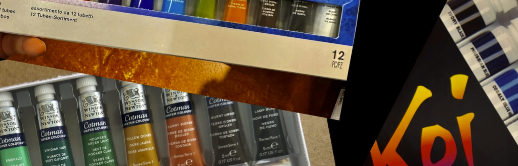
In this tier, the goal is to remove fear and hesitation. These are paints you can use generously, without worrying about the cost and perfect lightfastness.
What matters here:
- Paints feel pleasant to use: reasonably bright, not extremely chalky, and able to mix clean colors.
- You don’t need museum-level permanence if you’re primarily using them for mixing exercises, drills, and experimentation.
There are many economical student‑grade sets available. Some are surprisingly vibrant and fun, even if the pigment information and permanence are not ideal for long‑term work. Think of these as learning tools.
Examples to consider:
- Sakura Koi Watercolor – Set of 12, Assorted Colors, 5 ml Tubes:
Available at Blick and Amazon - Sakura Koi Watercolor – Set of 24, Assorted Colors, 5 ml Tubes:
Available at Blick and Amazon - Winsor & Newton Cotman Watercolors – Set of 10, Assorted Colors, 5 ml Tubes:
Available at Blick and Amazon - Winsor & Newton Cotman Watercolors – Set of 20, Assorted Colors, 5 ml Tubes:
Available at Blick and Amazon - ShinHan Professional Watercolor Paint 7.5ml Tubes 30 Color Set:
Available at Amazon
Additional Considerations:
- Meiliang – 36‑color tube set
Entry-Level / In-Between Options
Before moving fully into artist-grade paints, it’s worth noting that some lines sit between student and artist grade in performance. These entry-level options can often be used for more than practice alone and may serve well for extended study. I would feel comfortable using some of these for serious work.
Examples to consider:
Study & Archival Tier: Affordable Artist-Grade Paints
This tier is for deeper study and for paintings you want to keep, frame, gift, or sell. You don’t need the most expensive brand, but you do want:
- Higher pigment load and better lightfastness, so your mixes are strong and dependable.
- Mostly single‑pigment colors, so mixing is predictable.
- Reasonable prices, so you feel comfortable actually using them.
Although I’m intentionally avoiding the very top-priced brands in this series, I’ve included two small Daniel Smith options for those who can afford them and want to experience top-tier quality in a minimal, focused way.
Within this under-$50 price range, it was difficult to include only tube paints, which I generally prefer. Nevertheless, I’ve also included a pan set in this tier so you still have the opportunity to work with high-quality paint.
Examples to consider:
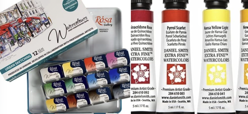
- Rosa Gallery Monopigmented Professional Watercolor Paint Set, 12 Water Colors of 2.5 ml:
Available at Amazon - Daniel Smith Extra Fine Watercolor – Set of 3, Primary, 15 ml Tubes:
Available at Blick and Amazon - Daniel Smith Extra Fine Watercolor – Set of 6, Essentials, 5 ml Tubes:
Available at Blick and Amazon
Closing Thought
This series is not about hunting for the “best” materials. It’s about building a practice that feels sustainable—financially, creatively, and emotionally.
Fewer tools, chosen thoughtfully, often lead to better learning than a crowded palette chosen out of fear or pressure. Start with what you can afford, use it fully, and let your materials grow alongside your skills.
In the next post, I’ll apply the same approach to watercolor paper, which matters just as much as paint.