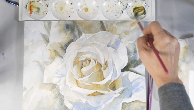
What 3 Colors Can (and Can’t) Do | Daniel Smith Primary Set Demo
A closer look at Daniel Smith’s Primary Watercolor Set of 3
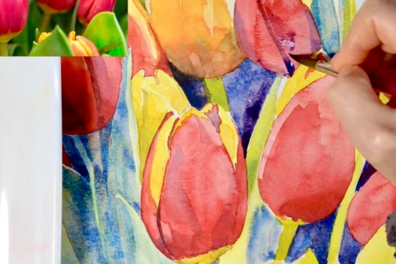
This lesson is a follow-up to my ‘Essential Budget-Conscious Watercolor Paints (That Even Pros Use)’ series, where I introduced the 3-6-9 palette structures. Here, we finally put the 3‑color palette to work in a real painting.
This lesson is a follow‑up to my Essential Budget‑Conscious Watercolor Paints (That Even Pros Use) series, where I introduced the 3‑6‑9 palette structures. Here, we finally put the 3‑color palette to work in a real painting.
For this demonstration, I used Daniel Smith’s Primary Watercolor Set of 3:
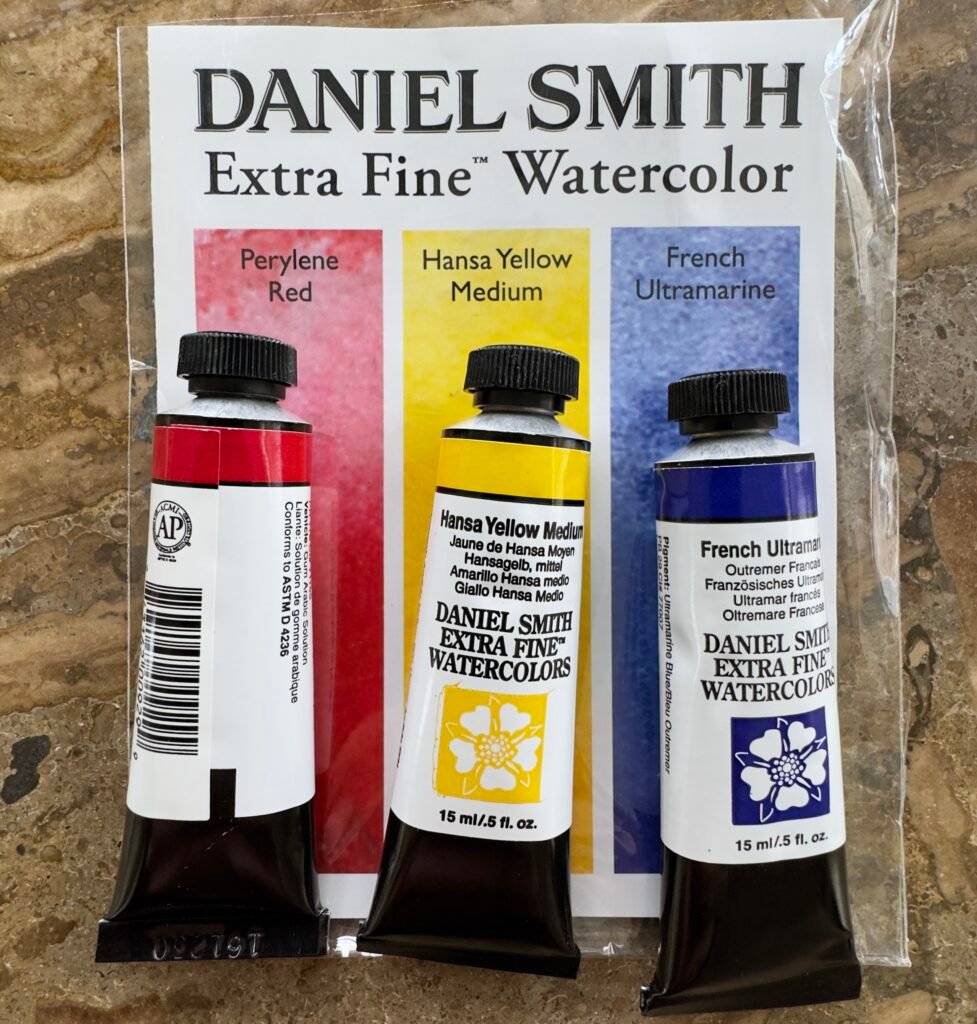
- Perylene Red: a deep, slightly yellowish/brownish red—closer to a maroon than a clean magenta
- Hansa Yellow Medium: a middle, slightly warm yellow (leaning gently toward orange)
- French Ultramarine: a warm, red‑biased blue, leaning toward violet rather than green
In this lesson, I will walk through the strengths, limitations, and distinctive mixing behavior of this triad, while also showing the range of colors it can produce.
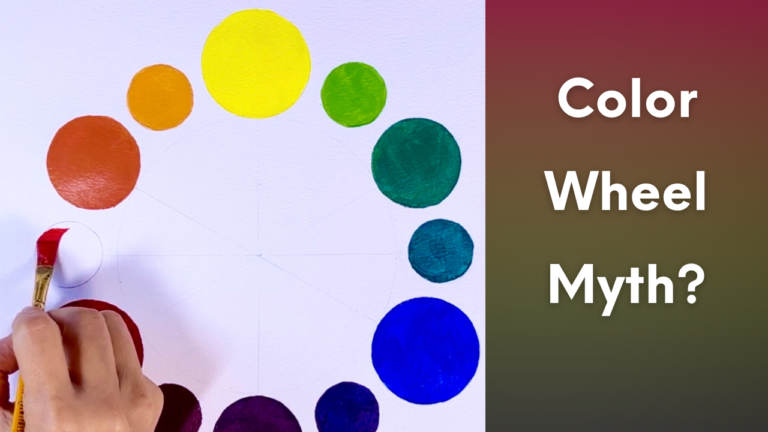
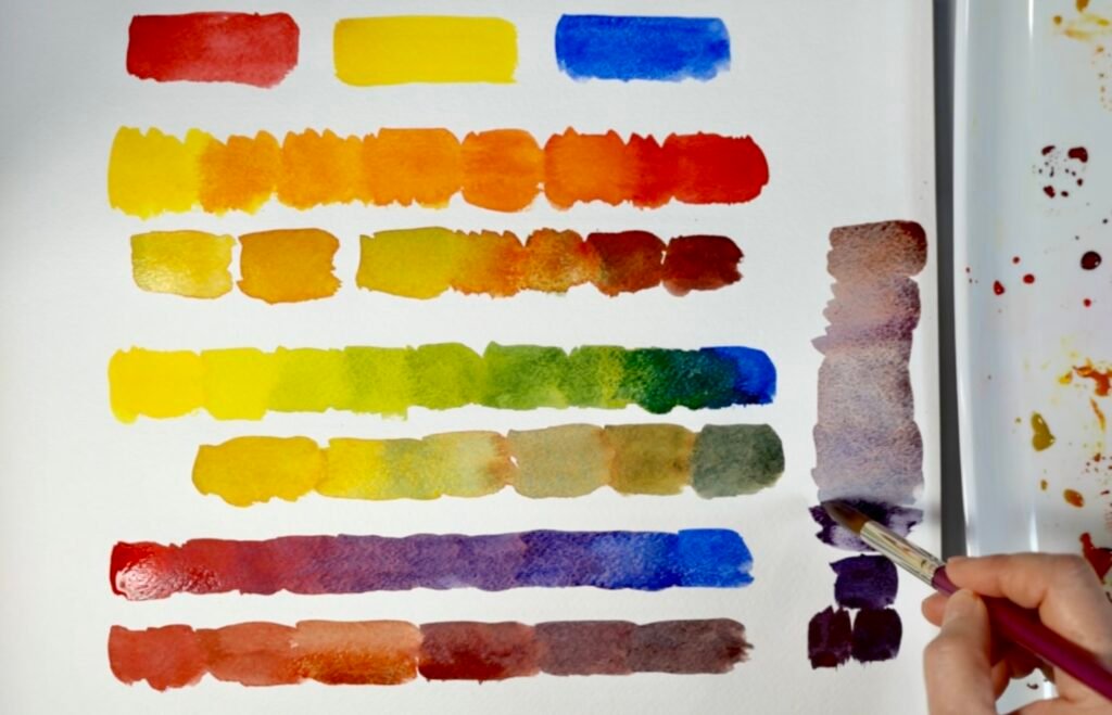
Why don’t these primary colors mix clean secondaries?
At first glance, these three seem like a straightforward and balanced red, yellow, and blue. However, once we begin mixing and painting with them, we quickly discover that they do not behave like the idealized primaries we often imagine from a color wheel.
In my earlier lesson, The Color Wheel Isn’t What You Think, I explained that primary colors do not automatically produce clean, ideal secondaries in real paint. That is especially true for greens and purples.
This is because there is no perfectly universal set of three primaries that suits every artistic purpose. Every pigment carries a slight bias toward another hue. Some colors lean warm, others cool. Those hidden tendencies strongly affect the mixtures we get.
This triad is a perfect example.
Strengths of this set
This set has several appealing qualities from the start.
Highly pigmented, single‑pigment paints
All three are rich, single‑pigment colors, so mixes are predictable and a little paint goes a long way. That makes this set excellent for seeing cause‑and‑effect in color mixing.
Natural, versatile overall look
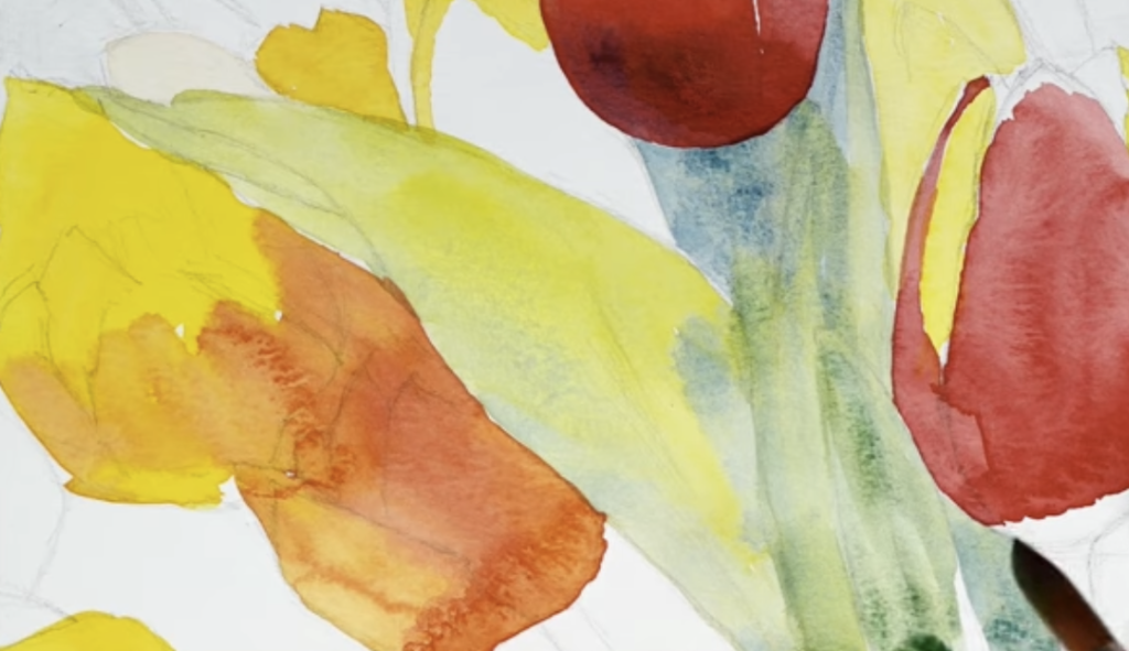
The triad is surprisingly neutral and versatile. You can get a wide variety of hues even though the overall chroma stays restrained. Many elegant paintings depend more on subtle shifts, neutrals, and temperature changes than on loud saturation, and this set supports that beautifully.
Beautiful greys, browns, and shadows
Perylene Red + French Ultramarine + Hansa Yellow Medium create rich, organic greys and browns that are perfect for landscapes, natural shadows, and atmospheric scenes. It’s easy to mix chromatic blacks and both warm and cool darks.
Strong value range
Both Perylene Red and French Ultramarine can go very dark, so you can push real high contrast with only three tubes. The set is excellent for learning to control value.
Limitations of this set
At the same time, this palette has clear limitations: muted greens and purples.
Why the greens are subdued
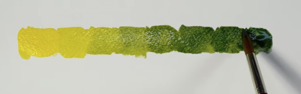
- Hansa Yellow Medium is a middle, slightly warm yellow leaning gently toward orange.
- French Ultramarine is a warm, red‑biased blue, leaning toward violet rather than green.
When you mix a warm yellow with a warm, red‑biased blue, both colors are quietly bringing extra red into the mix. Red is the complement of green, so that hidden red cancels some of the green’s intensity.
Result: the greens naturally slide toward olive, sap‑like, or foliage greens, not bright, spring‑grass greens. These are excellent for natural landscapes and tree masses, but not ideal if you want sharp, electric, high‑key greens.
If someone wants fresher greens from a triad, you’d recommend swapping French Ultramarine for a cool, green‑biased blue such as Phthalo Blue (Green Shade) or Winsor Blue GS.
Why the purples are smoky
- French Ultramarine already leans toward red.
- Perylene Red is a deep, slightly yellowish/brownish red—closer to a maroon than a clean magenta.
So when you mix “red + blue,” you’re actually mixing red + blue + a bit of yellow (because of the yellowish bias in Perylene). Any time all three primaries enter the mix, chroma drops.
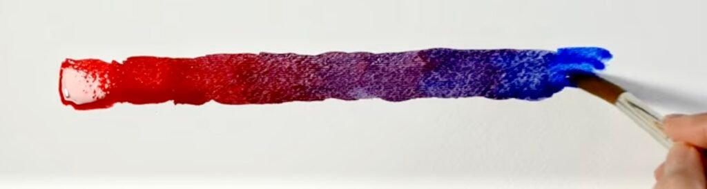
Result: you get smoky violets, wine tones, and deep shadow colors, rather than bright jewel‑like purples. These violets can be very elegant and dramatic, but they’re not the right choice for intense floral petals or glowing magenta passages.
However, the same pairing—French Ultramarine + Perylene Red—produces fantastic dark neutrals, shadow violets, and near‑blacks, which is one of the real strengths of this set.
How each pair behaves
Yellow + Red (Hansa Yellow Medium + Perylene Red)
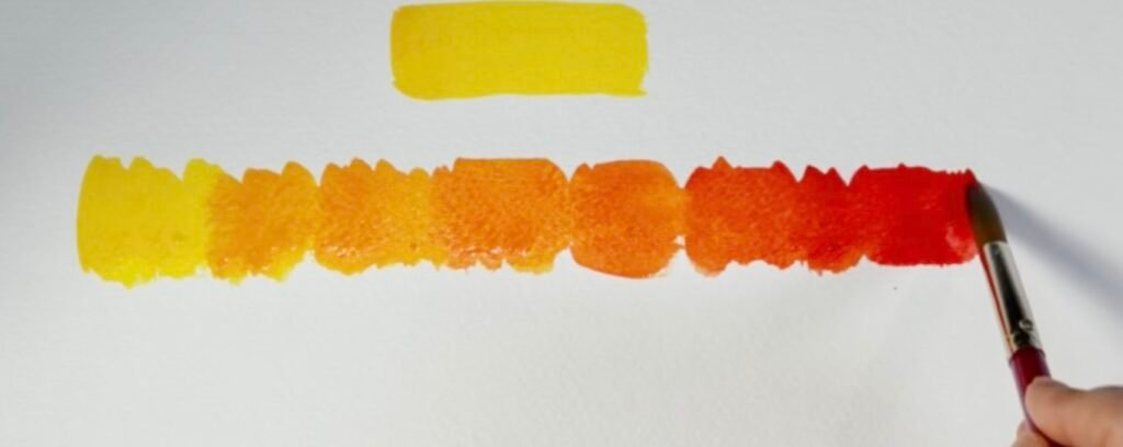
Hansa Yellow Medium and Perylene Red can create warm and attractive oranges, but they are often more earthy than brilliant. These mixtures are useful for:
- Warm, attractive oranges and earth oranges.
- Great for autumn foliage, skin undertones, muted florals.
- Less ideal for very bright, “citrus” oranges and blazing highlights.
Yellow + Blue (Hansa Yellow Medium + French Ultramarine)
Hansa Yellow Medium and French Ultramarine create naturalistic greens, but not especially bright ones. Because French Ultramarine is a warm, red-biased blue, it does not move cleanly toward green. The result is often:
- Useful, natural greens and foliage mixes.
- Excellent for landscape greens, tree shadows, subdued greenery.
- Not ideal for luminous spring greens or very clean turquoise‑like mixes.
These are often beautiful and useful in painting, but they are not the fresh, luminous greens that a cooler blue would produce.
Red + Blue (Perylene Red + French Ultramarine)
Perylene Red and French Ultramarine can create rich and dramatic dark mixtures, but their violets are usually muted rather than luminous. Because Perylene Red is deeper and heavier than a rose or magenta-leaning red, the resulting purples tend to become:
- Strong for shadow violets, muted purples, deep atmospheric darks.
- Perfect for mixing chromatic blacks and rich neutrals.
- Weak for clear violet or magenta‑like passages.
All three together
When all three colors are mixed, they can produce a very dark value, close to black, either warmer or cooler. These mixes create beautiful chromatic greys and natural neutrals.
A brighter alternative triad (and its trade‑offs)
If you want cleaner, more saturated greens and purples, I suggest a more CMY‑style triad:
- Yellow: Hansa Yellow Light (PY3 or PY154) – cool, lemon yellow.
- Red: Quinacridone Rose (PV19) or Quinacridone Magenta (PR122) – cool, bluish reds that make clear violets.
- Blue: Phthalo Blue (Green Shade) (PB15:3) – cool, green‑biased blue that makes vivid greens.
This trio gives bright purples and high‑chroma greens, but it also has limitations:
- Colors can feel too intense if not carefully controlled.
- Phthalo Blue is very strong and can easily dominate mixtures.
- It is less naturally earthy, so you may work harder to tame colors for quiet, atmospheric scenes.
Materials Used and Recommended
– Daniel Smith Extra Fine Watercolor – Set of 3, Primary, 15 ml Tubes
Available at Blick
– Palette/ Mixing Surface
Repurposed plastic cake pan
Some links may be affiliate links. I only recommend materials I use or trust.
Final Thoughts
There is no perfect set of three primaries for every purpose.
There is always a trade‑off, no matter which three primaries you choose. A “better” triad only exists in relation to what you’re trying to paint.
The Daniel Smith Primary Set shines when you want realistic neutrals, earthy foliage, and atmospheric darks. A CMY‑style triad shines when you want bright greens and purples and a more graphic, high‑chroma look.
Harmony often comes from limitations. A restricted palette isn’t just about buying fewer tubes; it’s a way to see the personality of each pigment more clearly and to understand how real paints behave on paper.
I strongly encourage experimenting with different primary triads over time. The more combinations you test, the more clearly you will understand the strengths and limitations of each pigment.
Eventually, you can discover the trio that best supports your own artistic goals, subject matter, and visual language.
YouTube Video
Please click the image to watch the video.