How to Paint White Without White Paint in Watercolor: How Complementary Colors Do All the Work
Painting white objects can be surprisingly challenging, especially in watercolor. One of the most common questions I receive is how to paint white without white paint, along with how to mix convincing grays in watercolor.
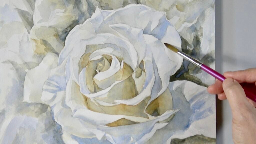
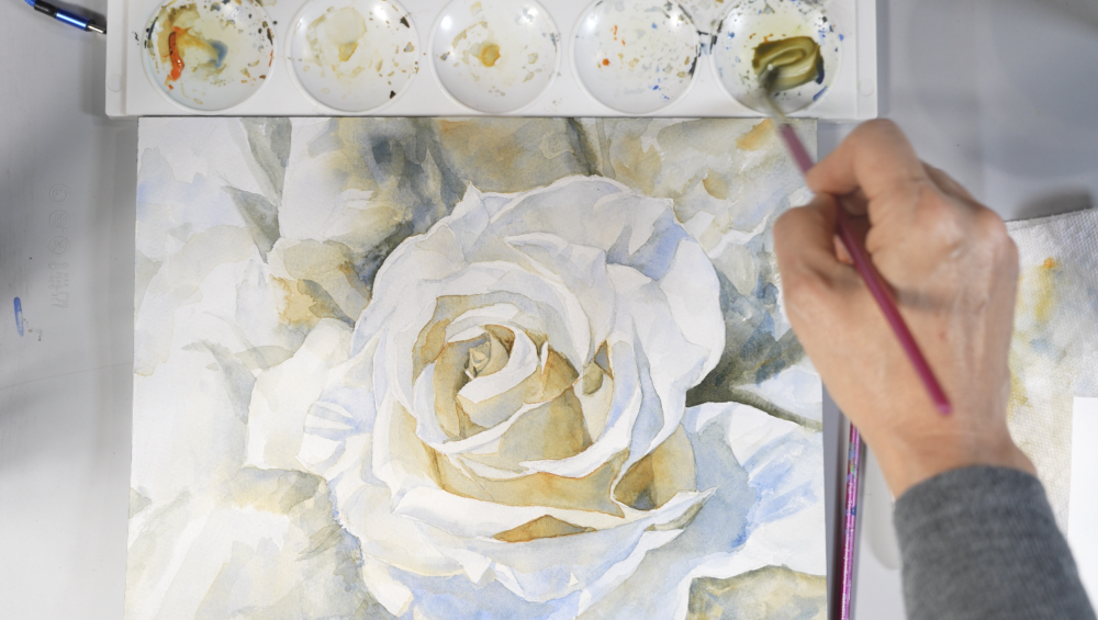
In this demonstration, I wanted to bring those two questions together. I painted a white rose using only two complementary colors: orange and blue.
In watercolor, the brightest whites usually come from the untouched paper. The form is created not by painting the white itself, but by carefully observing the value shifts and subtle temperature changes around it.
This is where complementary colors become especially useful. When orange and blue are mixed together, they can create a wide range of warm and cool neutrals. These neutrals allow us to paint the shadows of a white object without making them look flat, heavy, or lifeless.
Why White Objects Are Excellent Value Practice
White objects are one of the best subjects for studying value. I talked about how starting with white objects sharpens your observation skills and helps understand value in ‘Why Start with Black and White?’
Because there is little local color to distract us, we can focus more clearly on light and shadow. A white rose, a white cup, a folded paper form, or a white cloth all reveal how value alone can create a strong sense of three‑dimensional form.
A white object is never simply “white.” It contains:
- bright highlights
- pale middle values
- cool shadows
- warm reflected light
- darker accents
- soft transitions
- lost and found edges
Once we begin to see these shifts, we understand that value, not a tube of white paint, is what makes a white form feel convincing.
Why Watercolor Does Not Need White Paint
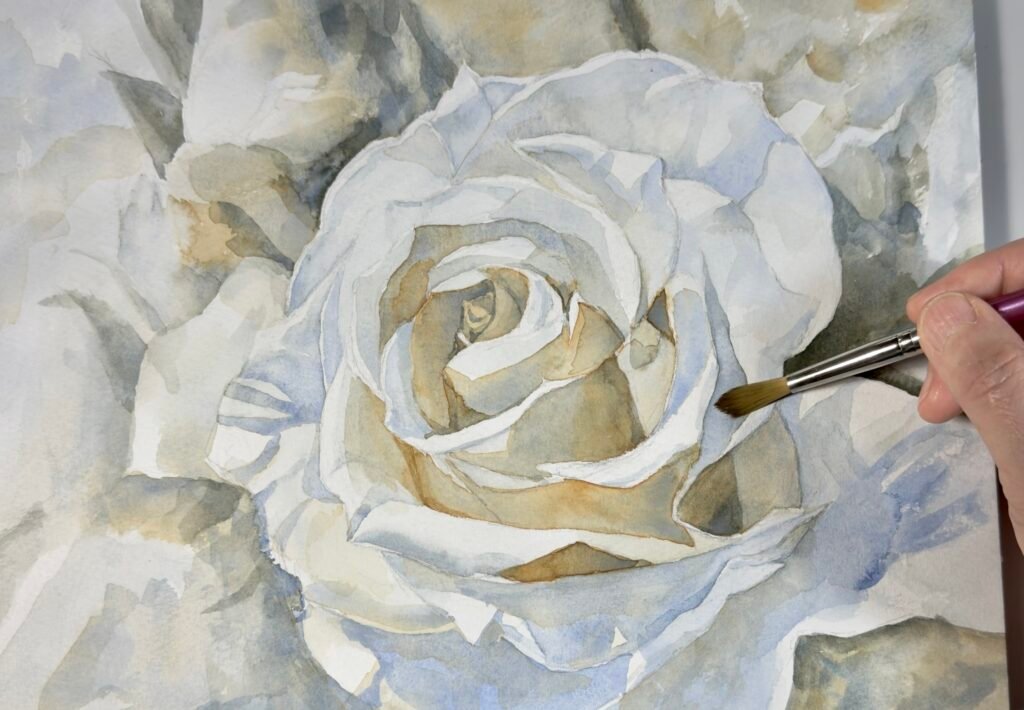
In opaque painting, such as acrylic or gouache, artists may use white paint to lighten mixtures or build highlights. In traditional transparent watercolor, we take a different approach.
The white of the paper becomes the lightest value. Instead of adding white paint, we control lightness by:
- dilution with water
- working in transparent layers
- preserving untouched paper
- softening edges
- building shadows gradually
This is why planning is especially important in watercolor. Once a very light area is covered too darkly, it can be difficult to return it to a clean white.
So when painting a white rose, the question is not, “Where do I put white?”
The better question is, “Where do I preserve the light, and where do I place the shadows?”
Creating Neutrals from Complementary Colors
There are many ways to mix neutrals; this is just one approach. You can experiment with other pairs and adjust your palette to fit the mood and lighting of your subject.
For this study, I limited myself to only two watercolor paints:
- Cadmium Orange Hue
- Ultramarine
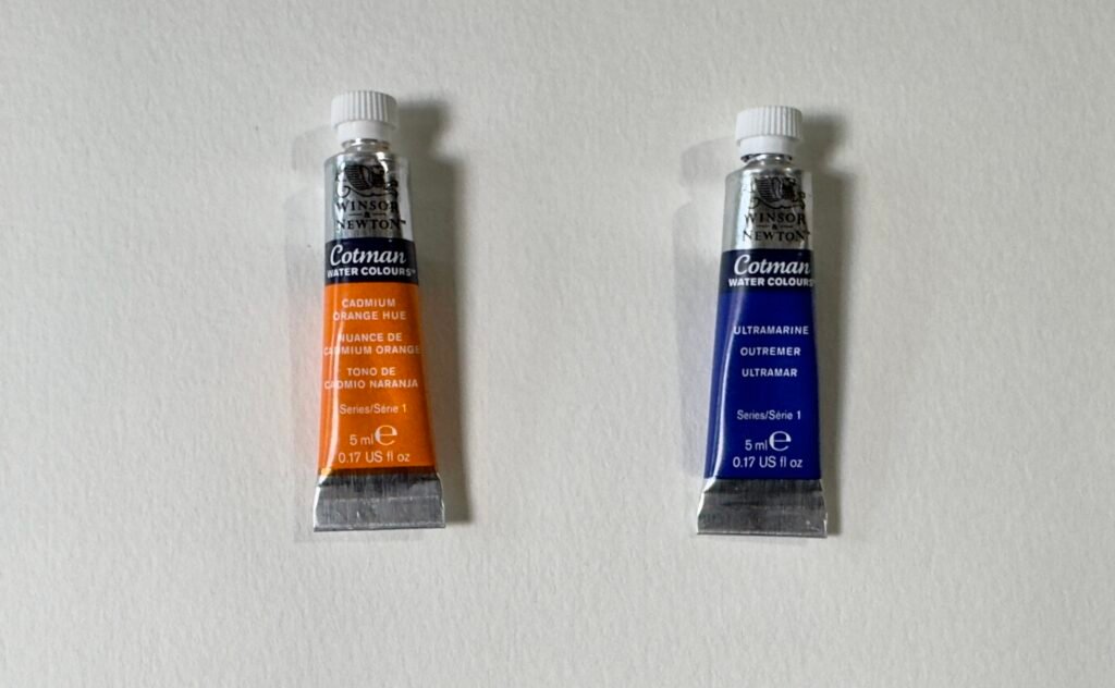
Both are from the Winsor & Newton Cotman range.
These are complementary or near-complementary colors. They sit directly opposite each other on the color wheel. When mixed together, they begin to neutralize each other.
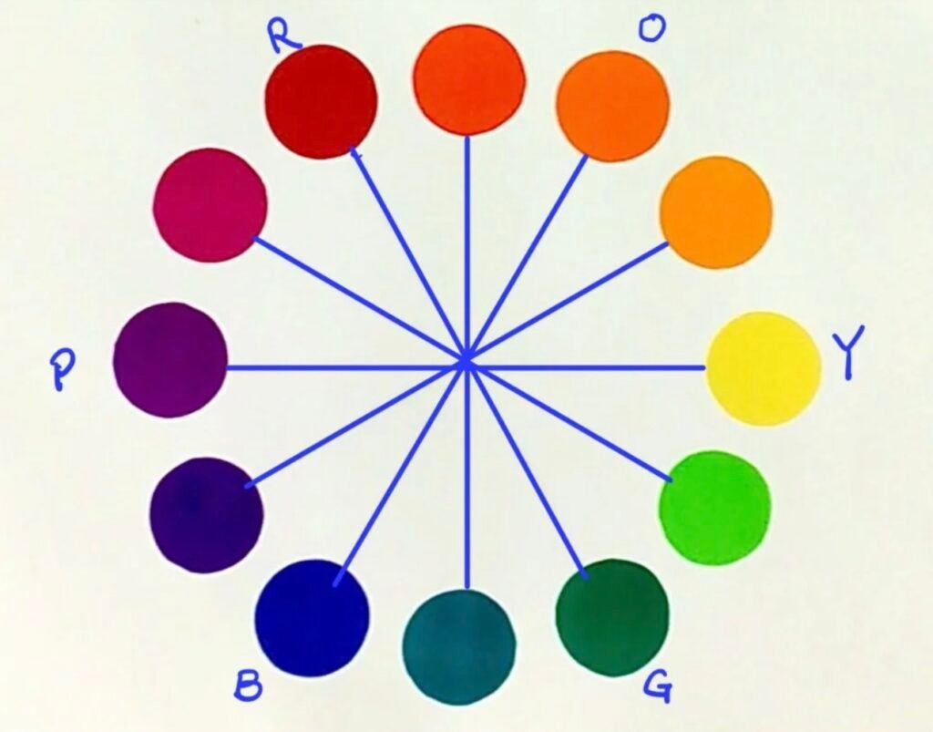
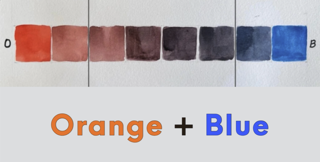
This makes complementary mixtures very useful for painting white objects. Instead of reaching for a flat black or premixed gray, we can create shadows that feel more natural, atmospheric, and full of subtle color.
Building a “Living Gray” and Value Scale
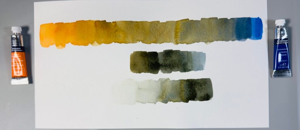
I began by creating a simple color swatch with these two paints.
At the top, I painted a transition from orange to blue, watching how the color shifted from warm to cool and gradually neutralized as the two mixed.
In the middle, I looked for the most balanced mixture—the point where orange and blue met to form the most neutral gray I could achieve with these two colors. It is not black and not a tube gray, but a “living gray” mixed from color.
At the bottom, I used that neutral mixture to create a value scale, moving from light to dark by adjusting the ratio of pigment to water.
The paper provides the light, and the concentration of pigment controls the dark.
A Brief Note on Cotman Watercolors
For this demonstration, I used Winsor & Newton Cotman watercolors: Cadmium Orange Hue and Ultramarine.
Cotman is a student-grade watercolor range, but in this particular study, I found that the mixture had a good amount of pigment strength. The colors did not become noticeably weak or pale after drying, which helped me build a useful value range.
This is a helpful reminder that foundational learning does not always require the most expensive materials.
Applying the Mixture to a White Rose
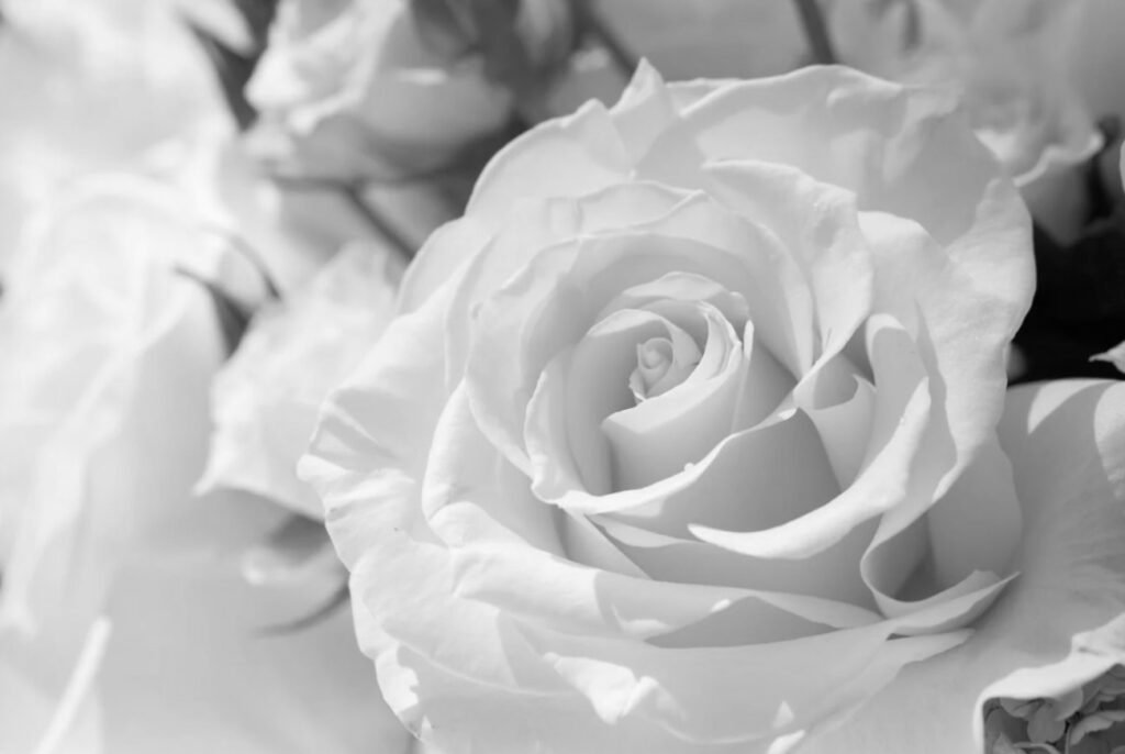
For copyright considerations of this image, I am sharing only a black and white reference photo. I used the full neutral range of my two complementaries, leaning toward warmer neutrals in the central petals, and shifting to cooler neutrals toward the outer petals.
I began by identifying the lightest areas of the flower. These areas were left mostly untouched, allowing the white of the paper to remain visible.
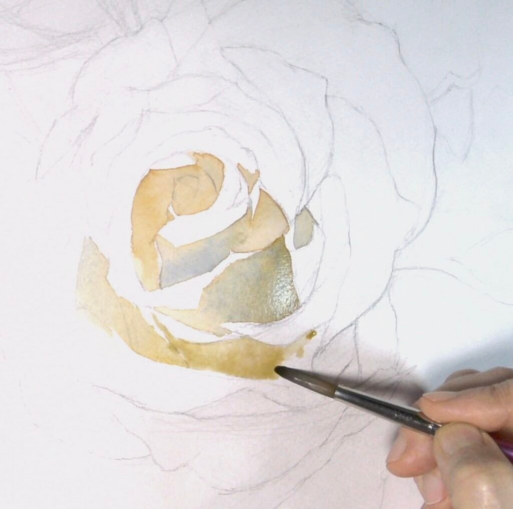
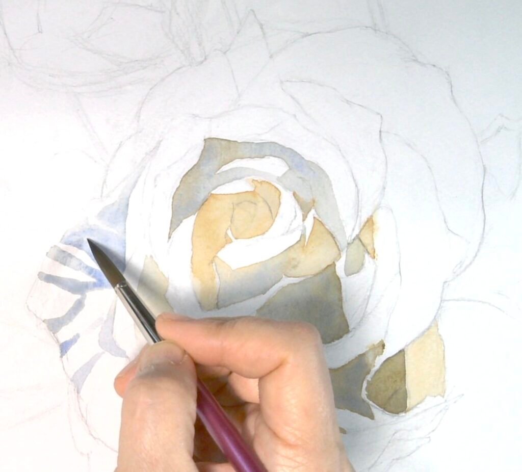
Next, I looked for the major shadow shapes. Instead of outlining every petal, I focused on where one value shape met another. The goal was to build the structure of the rose through value relationships.
Again, with a white rose, we are not really painting the white itself. We are painting the shadows, the soft value changes, and the subtle shifts in color temperature that allow the white to appear.
Some shadows leaned cooler, so I used a mixture with more Ultramarine.
Some areas felt warmer, so I allowed more of the orange-neutral quality to remain.
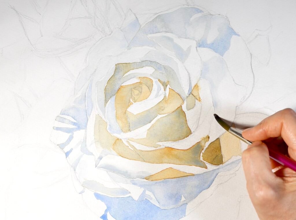
Now you can clearly see the full range created by the two complementary colors—from the warmer neutrals in the center of the flower to the cooler neutrals toward the outer petals and edges.
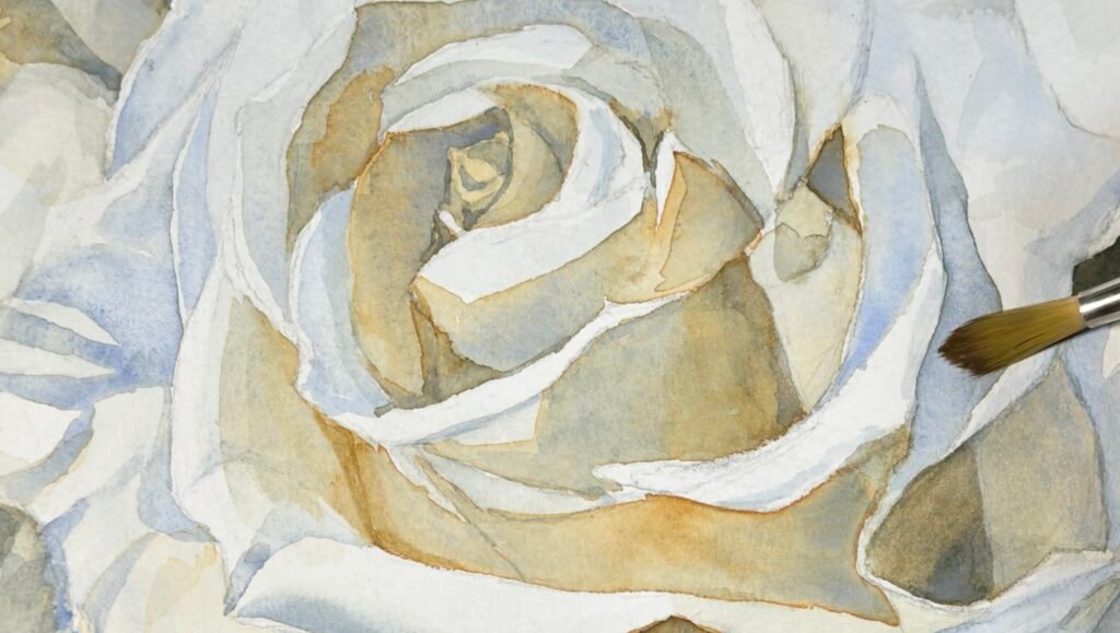
Don’t Forget the Background
It is tempting to leave the background until the very end, but I recommend working on it alongside the flower. The background is not just an empty area behind the subject; it is an essential part of the whole composition.
It helps define the edges of the flower, creates contrast, and supports the overall mood and balance of the painting.

Knowing When to Stop
Ideally, it is best to establish the value relationships as accurately as possible in the first layers. This helps preserve the freshness and transparency that are so essential to watercolor. But in practice, there is almost always something to refine.
You can certainly return to adjusting the values, but keep one principle in mind: maintaining the fresh quality of the painting is often more important than correcting every small value difference.
This balance is one of the most difficult judgments in watercolor. I have had many moments when I kept going back, trying to fix the values, only to lose the freshness of the painting.
We all know that struggle. Many of us know the feeling of pushing just a little too far—trying to fix one more thing and watching the painting lose its sparkle. But knowing when to stop is often as important as knowing what to paint.
In this study, the goal was not to paint every petal with the same level of detail. Instead, the process was about painting around the light—preserving the brightest areas, gradually building the shadows, and allowing the white to emerge through the structure of values.
As you patiently develop those relationships, the form of the rose gradually begins to emerge.
Two colors. Water. And the white of the paper.
That is the entire painting.
Materials Used and Recommended
While this demo uses only two colors, for regular painting I suggest at least a 20‑color set so you have a wider range of helpful hues to choose from.
Paints used in this demo: Cadmium Orange Hue, Ultramarine
Some links may be affiliate links. I only recommend materials I use or trust.
*Click the image below to watch the full step‑by‑step demo on YouTube.