Creating Mood in Art with Color Temperature: Warm & Cool Explained
Understanding color temperature is fundamental in both visual art and lighting. It shapes how artists express mood, depth, and atmosphere, making it a powerful tool for visual storytelling.
*Helpful post for this lesson: Color: Painting Color Wheel – Beginner’s Guide to Hues
What Is Color Temperature?
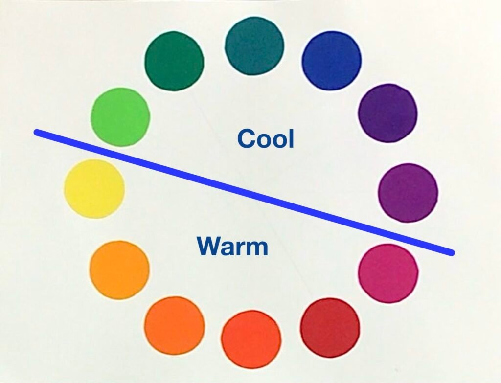
Color temperature describes where a color falls on the spectrum of warmth or coolness. This perception is rooted in psychology and optical science:
- Warm colors: Reds, oranges, and yellows. These hues evoke feelings of warmth, energy, and comfort.
- Cool colors: Blues, greens, and purples. These evoke calmness, distance, and serenity.
Key point: These classifications are general guidelines—not rigid rules. Each color contains both warm and cool variations depending on its specific hue and context.
The Relative Nature of Color Temperature
Color temperature is not absolute; it’s always perceived in relation to surrounding colors:
Examples:
- Green can appear warm when placed beside blue, but cooler next to yellow.
- Red, while traditionally warm, can seem cooler if next to a more vibrant orange-red.
Categorizing Warm and Cool Colors
Warm Colors
Typical Warm Colors:
- Red
- Orange
- Yellow
- Red-Orange
- Yellow-Orange
Effects of Warm Colors:
- Visually advance—making objects appear closer.
- Evoke comfort, excitement, and sometimes urgency.
- Often become focal points due to their attention-grabbing qualities.
Cool Colors
Typical Cool Colors:
- Blue
- Green
- Purple (Violet)
- Blue-Green
- Blue-Violet
Effects of Cool Colors:
- Visually recede—giving compositions a sense of depth or space.
- Suggest peacefulness, cleanliness, serenity, and sometimes detachment.
- Useful for backgrounds and calming environments.
Variations and Context: Warm and Cool Versions Within a Color
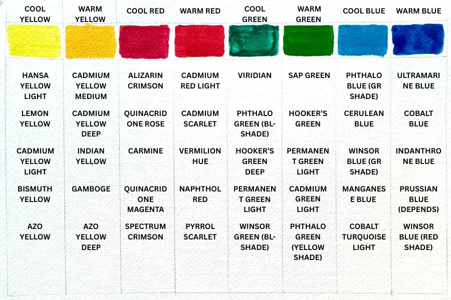
Every major color group contains both warmer and cooler variants, depending on their color bias:
- Warm blue: Leans toward purple.
- Cool blue: Leans toward green.
- Cool red: Leans toward blue; warm red leans toward orange.
Some colors, like magenta, can be challenging to categorize. Their perceived temperature depends on specific shade and neighboring hues.
Why a Painting with Warm Colors Might Appear Cool
When painting, even a palette limited to warm colors can end up feeling unexpectedly cool if you mix with neutral grays for shading or modeling values. This is because:
- Gray is achromatic—it lacks color temperature.
- When paired with vibrant warm colors, neutral gray visually “dampens” the intensity and can shift the whole palette toward coolness.
Tip: If your aim is to maintain warmth with value changes, consider using grays that are biased warm (by mixing in a touch of red, yellow, or orange), or use warm earth tones for shading.
Creating Mood with One Dominant Temperature
Choose a Dominant Temperature
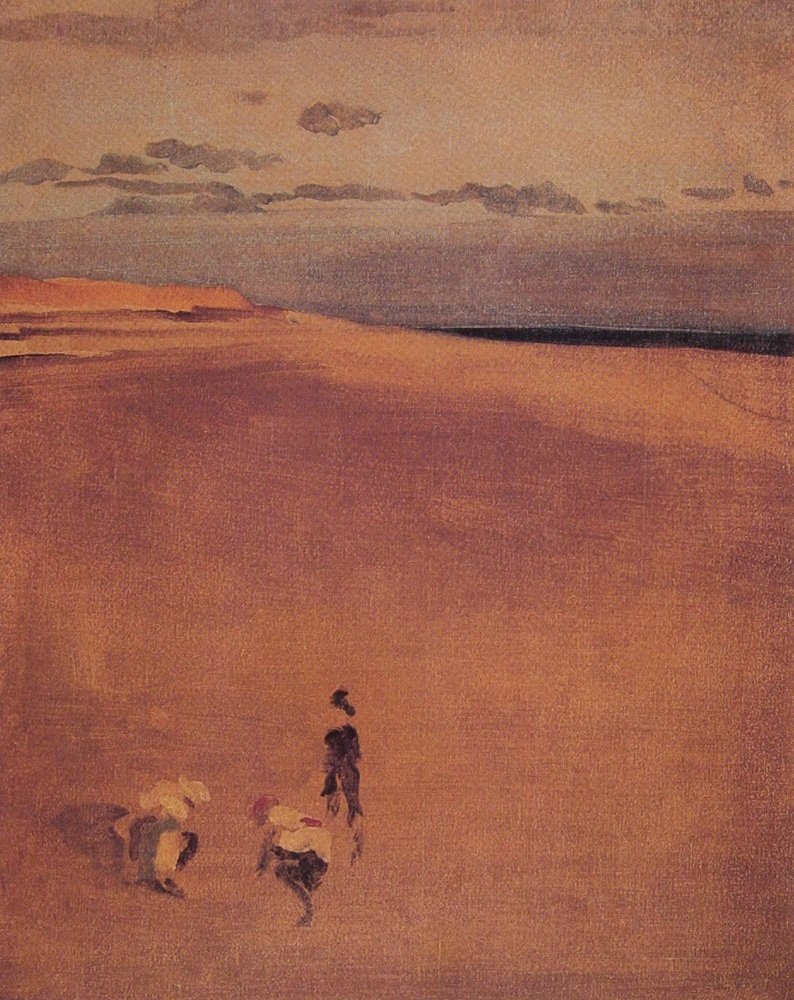
James Whistler, The Beach at Selsey Bill, 1865
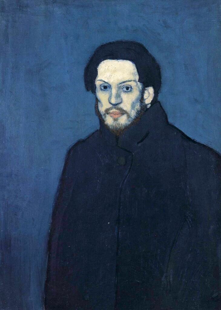
Pablo Picasso, Self-Portrait, 1901
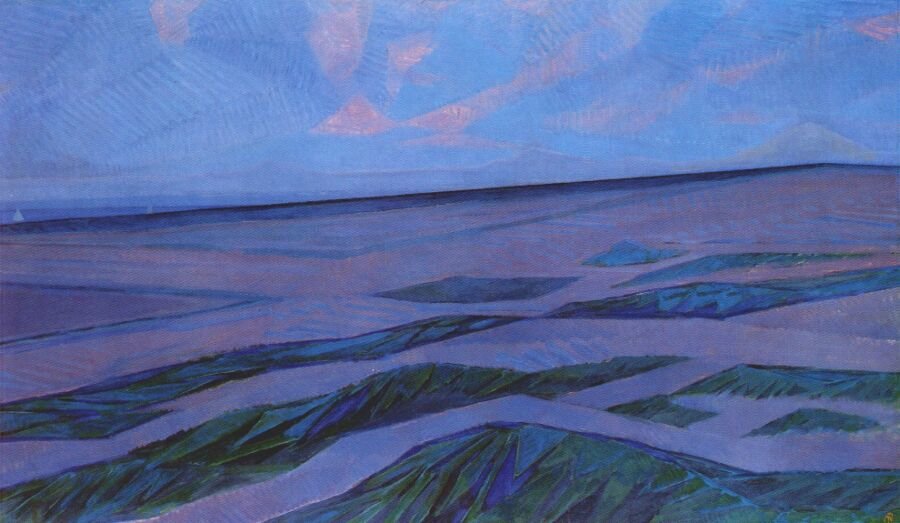
Piet Mondrian, Dune Landscape, 1911
No matter the subject—still life, portrait, or landscape—you can create a compelling and unified mood simply by controlling the temperature of your colors.
By consciously choosing a warm or cool palette, you set the emotional tone of your artwork:
- Warm tones (reds, oranges, yellows) instantly evoke energy, intimacy, and vibrancy—ideal for lively interiors, sunlit portraits, glowing landscapes, or cozy autumn scenes.
- Cool tones (blues, greens, violets) convey calm, tranquility, and distance—perfect for serene seascapes, contemplative portraits, or misty atmospheric landscapes.
This approach works across all genres because color temperature shapes atmosphere and feeling more powerfully than literal local color. Whether you’re painting a bowl of fruit, a human figure, or a sweeping landscape, the mood will shift dramatically depending on your chosen temperature.
Artists often use this tool deliberately, sometimes even stepping away from realism, to create paintings that connect emotionally with viewers.
Using Opposite Temperature Sparingly
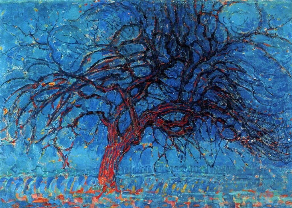
Piet Mondrian, The Red Tree, 1908 – 1910, Oil on Canvas
Working with a dominant temperature doesn’t mean excluding the opposite temperature entirely—it means using it strategically.
A single temperature can set a strong mood, but if it dominates too completely, the painting can start to feel flat or monotonous. The solution is to add small touches of the opposite temperature to create contrast, variety, and visual interest.
For example:
- In a warm sunset landscape, introducing cool-toned shadows can make the sunlit areas feel even warmer by contrast.
To keep the mood cohesive, treat the opposite-temperature colors as a supporting accent—small but intentional. For example: 70–80% dominant temperature and 20–30% opposite temperature.
*In short: The magic isn’t only in what you paint—it’s in how your temperature choices make people feel.
Lesson Focus
In this lesson, you will:
- Select at least two colors from either the warm or cool color family.
- Use a range of neutral grays to establish your value structure.
- Avoid using only one color, as we have already explored monochromatic tonal painting.
- You may include opposite-temperature colors as long as your dominant temperature remains clear (e.g., warm 70–80% / cool 20–30%).
This is a good transitional exercise—bridging limited-palette work and future full-palette projects—designed to strengthen your control of temperature, mood, and value in your paintings.
*Important: Do not focus on the local colors (the true color of an object) of your subject.
For example, if you decide to create a cool-color painting using green and blue, and your subject is red apples, you should still render them in your chosen green and blue. It’s surprisingly common for artists to unintentionally shift back to local colors out of habit—stay mindful of the lesson’s objective.
In my demonstration, I selected yellow and red for a warm-color painting. You may notice that the final piece doesn’t feel entirely warm in temperature—this is due to the interaction of neutral grays with warm hues (as explained above).
The nuances of maintaining warmth across all values will be introduced in future lessons.
Materials Needed
- Acrylic or gouache paints: minimum two hues from either the warm or cool color family, black, and white/ optional-opposite temperature hue(s)
- Sturdy painting surface (watercolor paper, Bristol board, or canvas)
- Flat and round brushes
- Still life or other subject of your choice
- Value scale
Follow Along with Your Reference
It will be very helpful to review my earlier post on Monochromatic Tonal Painting before starting this lesson. The steps are essentially the same, except here we add more hues. You can apply these steps to any subject matter you choose.
For my demonstration, I intentionally selected cool-colored tapes as my subject to paint in warm colors. Watching the process in my video will make the instructions much clearer and easier to follow!

