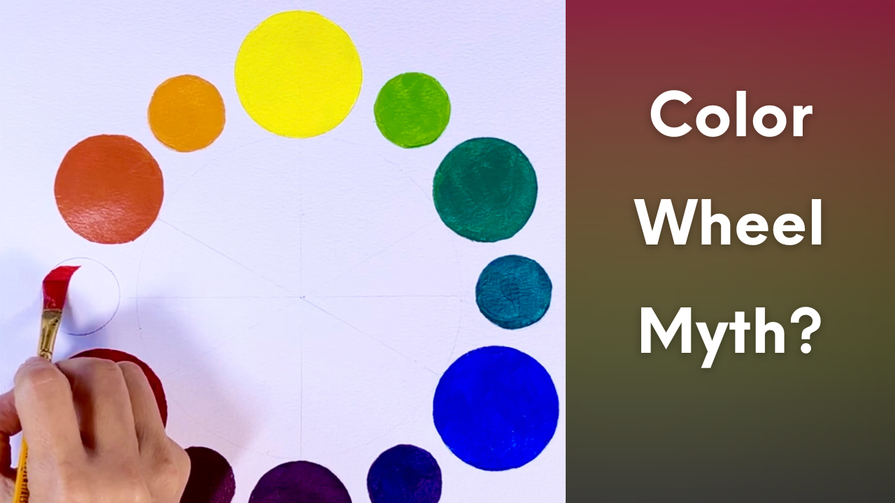
The Color Wheel Isn’t What You Think (Hue, Color, Black & White)
Most artists learn the color wheel as primaries and secondaries, but almost no one explains what a hue really is, how it differs from color, or where black and white fit into the system.
So in this lesson, we’re going to build the color wheel—step by step, and use it to clarify the difference between hue and color, plus the big question: Are black and white actually colors?
Painting Color Wheel – Beginner’s Guide to Hues
Primary Colors

Primary colors are colors that cannot be created by mixing other colors. In traditional painting, these are:
- Red
- Yellow
- Blue
Everything else we see on the color wheel grows out of these three.
Secondary Colors

Secondary Colors When we mix two primary colors in equal parts, we get secondary colors.
- Red + Yellow = Orange
- Red + Blue = Purple (Violet)
- Blue + Yellow = Green
Tertiary Colors

Tertiary Colors We create tertiary colors by mixing a primary color with a neighboring secondary color. This process yields six tertiary colors:
- Red + Orange = Red-Orange
- Yellow + Orange = Yellow-Orange
- Yellow + Green = Yellow-Green
- Blue + Green = Blue-Green
- Blue + Purple = Blue-Purple (Blue-Violet)
- Red + Purple = Red-Purple (Red-Violet)
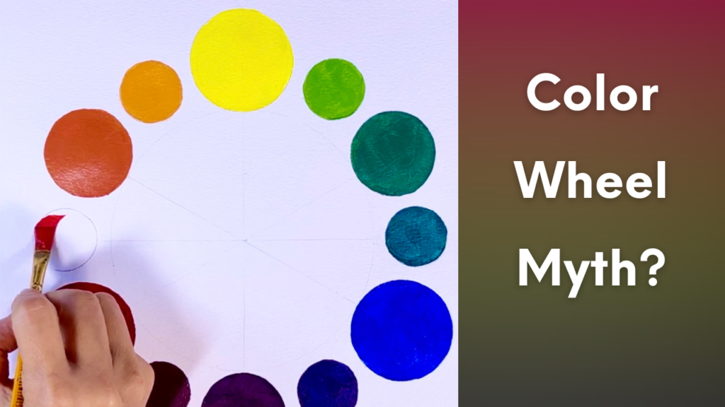
Together, these form a 12-hue color wheel.
Hue vs. Color:
The terms “hue” and “color” are often used interchangeably, but they have distinct meanings:

Hue
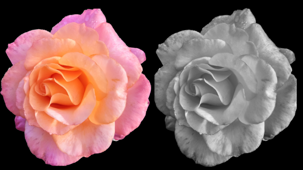
Hue refers to a color’s pure state without added white (tint) or black (shade). Hue refers to the basic identity of a color—its position on the color wheel. It includes primary, secondary, and tertiary colors, but not variations created by adding white, black, or gray.
You can think of hue as the “parent” color. For example, pink has a red hue, and turquoise has a blue-green hue.
Real Color vs Ideal Color
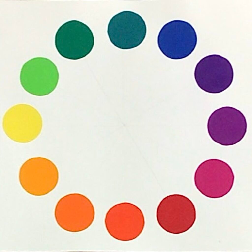
Now take a moment to really look at this painted wheel. Mixing the traditional red, yellow, and blue primaries does not produce perfectly clean secondary colors.
That’s normal, and in a later lesson, I’ll explain why these mixtures often appear slightly muted or “muddy.” On this wheel, the colors appear clearer… more even… almost ideal. So what’s the difference?
The first wheel shows how color behaves in real materials—paint, pigment, physical mixing.
The second shows a simplified model—what we expect color relationships to look like.
Understanding this difference allows us to recognize that color systems are not fixed truths, but frameworks shaped by medium and purpose.
Color
Color is a broader term encompassing all visual perceptions of hue, including variations created by mixing with black, white, or gray. Maroon (red + black) and pink (red + white) are both colors derived from the red hue.
Color is a broader term that encompasses hues as well as their variations, including:
- Tints (hue + white)
- Shades (hue + black)
- Tones (hue + gray)
* I will cover this topic in a separate lesson.
Are Black & White Colors?
Are black and white actually colors? There is a great deal of confusion around it. The answer depends on how we define color.
And to understand that, we need to look at two different systems.
Additive Color
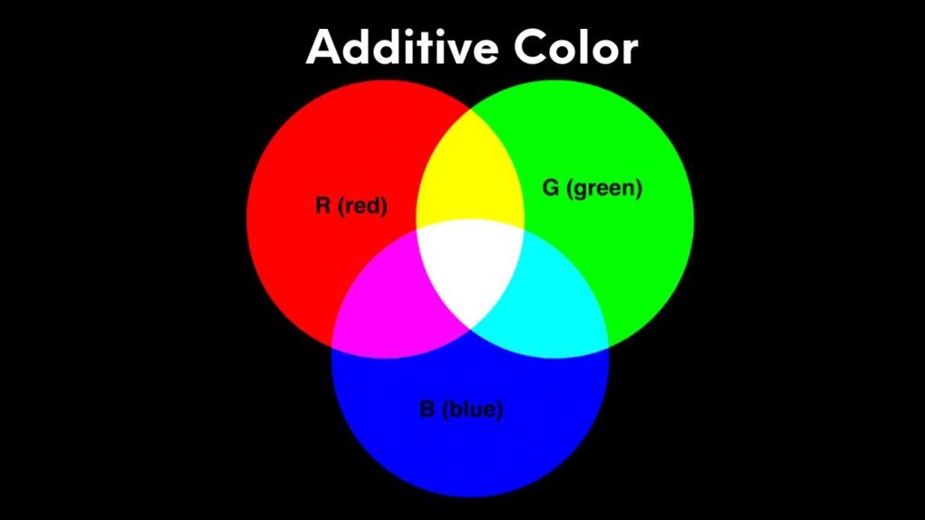
First, additive color. Additive color is based on light. You start with darkness. No light means black. As you add light, color begins to appear. And when red, green, and blue light combine fully, they create white. So in this system:
Black is the absence of light,
and white is the presence of all light.
Subtractive Color
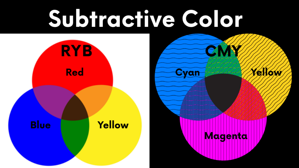
Subtractive color describes how physical materials—such as paint and ink—interact with light.
Now let’s return to painting. Here, we are not adding light—we are working with pigment. We start with a white surface, and every color we add absorbs(that means subtracts) part of that light.
The more we mix, the more light is removed, and the darker or muted the result becomes. Traditionally, artists use red, yellow, and blue as primaries(RYB). But in modern color theory—especially in printing and digital systems—a different set of primaries is used:
Cyan, magenta, and yellow (CMY). This system allows for much cleaner and more predictable color mixing.
And it helps explain why our painted mixtures sometimes feel imperfect.
Bridging the Systems
Now that we’ve seen how additive color works with light, and subtractive color works with paint and ink, we can start to bridge those systems.
Color simply behaves differently depending on the medium—whether it’s light on a screen, paint on a canvas, or ink on paper. In addition, artists, scientists, and everyday language do not always define “color” in the same way.
This is where much of the confusion comes from. So what we’re seeing is not a contradiction, but overlapping perspectives: people talking about light versus pigment, artists focusing on what is useful in practice, and physicists emphasizing on strict physical definitions. And then, how about everyday language? We casually refer to black clothing or white paint as “colors” without thinking twice.
How to Define Black & White
When people answer “yes” or “no” to the question, “Are black and white colors?”, most of the time, they’re just using different definitions of the word “color,” and talking past each other rather than actually disagreeing about the underlying science.
For this reason, the question of whether black and white are colors cannot really be answered with a simple yes or no. As painters, we don’t need to win that debate—we need something we can use on the canvas.
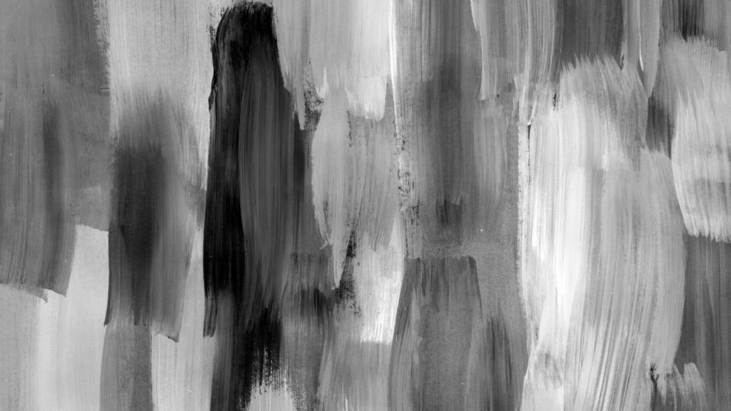
So here’s a simple, practical answer for artists: we usually treat black, white, and gray as achromatic colors—they’re colors without hue. They don’t get their own slice on the color wheel, but they absolutely matter in your painting decisions. They control value, contrast, and mood, and they’re often the key to making your hues really sing.


Closing Thought
The color wheel is not a fixed truth.The Color Wheel Isn’t What You Think (Hue, Color, Black & White)
It’s a tool.
And the more clearly we understand how it’s built—
the more control we gain as artists.
YouTube Video
Please click the image to watch the video.